Monday, 21 April 2014

Dadaism Case Study

Hello everybody! I have been on holiday for the past two weeks, so I didn't get around to doing this blog post until right about now, because now is a good enough time to start doing my case study on an art movement known as Dadaism.

Dadaism was an art and literary movement that peaked in Zurich, Switzerland between 1916-1922, before the Second World War began in 1939. The movement was considered to rebel against the war, politics and the government. This movement would soon spread around internationally, even after WWII was over in 1945, to places from Europe to New York City. Dadaism more often than not, overlaps quite well into surrealism, because sometimes the art and literature can have a sort of surrealistic feeling from time to time. It should be noted that Dadaism had actually influenced Surrealism as the artists had to think up ideas for artwork by trying not to think and let their imagination speak for itself. The surrealists had intended to continue the idea of a stream of the human conscience.

The key people that both pioneered and involved themselves with this movement were Hugo Ball, Emmy Hennings, Hans Arp, Raoul Hausmann, Hannah Hoch, Johannes Baader, George Grosz, Tristan Tzara, Richard Huelsenbeck, Beatrice Wood, Hans Richter, (who considered Dadaism 'anti-art'.) Marcel Duchamp (who's work were highly influential towards the development of conceptual art.) and several others. They had wanted this 'anti-art' form to be rather abstract, similar to Cubism, but they had wanted to do something new, while borrowing a lot of it's main influences from Abstraction and Expressionism, with Cubism becoming a part of it's influence later on (and to a lesser extent, 'Futurism'.) Dadaism can come in different forms of art including 2D and 3D collage (assemblage), photo-montage, (which are satirical collages that are created by using photographs.) and ready-mades (which are basically objects that the artists would purchase, modify it into something new and declare that object as art.) The public was at first disgusted by how the artwork was displayed-which was what the artists were initially encouraging at the time. This was due to the artists wanting to provoke the public on purpose, and then it got people into a huge debate of questioning what art really was.

Here are some famous examples of Dadaist "artwork".
This piece is a 'Readymade'
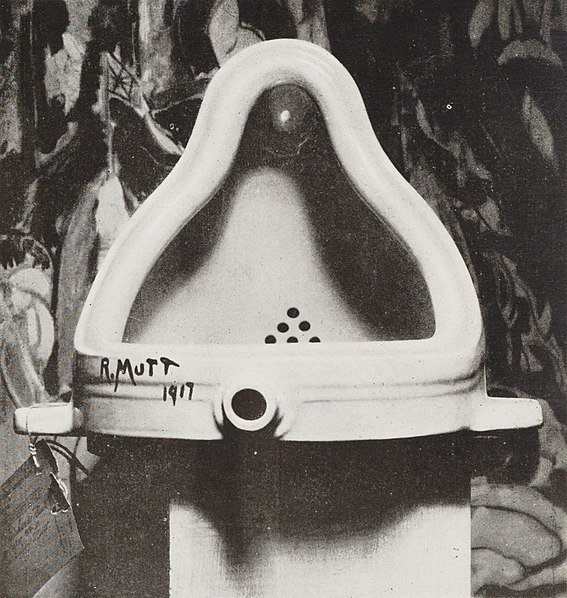
File:Duchamp Fountaine.jpg
Marcel Duchamp, Fountain, 1917, Photograph by Alfred Stieglitz
This "fountain" has had a lot of influence in the world of art, because it was actually a urinal that the artist had just bought so that he could sign his own name onto the urinal and call it art. It caused a lot of critics and observers to question if this was truly art or not, but at the same it change almost everybody's perspective of what art really was. This urinal was intended as a conceptual piece of art were Duchamp took an object that had a specific context and changed it's meaning and gave it a new context. This piece of work had pretty much introduced the idea of conceptual art into the art universe.

"It has become the work that removed art to the cerebral realm from the physical – or the “retinal” as Duchamp liked to call it – enabling Minimalism, Conceptualism, Performance Art and just about every other significant development of the past half century. It is the work, in short, that got art where it is today." 
(Quote from http://www.telegraph.co.uk/culture/art/art-features/9842887/Marcel-Duchamp-His-influence-is-still-everywhere-in-contemporary-art.html)

In other words, every art movement that was developed in the early twentieth century has been influenced by Duchamp's idea that art comes from the mind, and through physical means.

This another Readymade'
Marcel Duchamp, L.H.O.O.Q. 1919, original "Mona Lisa" by Leonardo Da Vinci, 1517
This another iconic picture that had further influenced the concept of art. It is the famous painting of the Mona Lisa by Leonardo Da Vinci, but this piece was altered by having facial hair added in by Duchamp. What would normally be considered vandalism if it were done illegally, is actually just an example of artists altering well known pieces of work and putting them into their own image just for their own benefit. The bigger meaning behind this piece was that the artist himself was basically telling the public that they have no resect for art anymore.

This an assemblage'
Raoul Hausmann, Mechanical Head, assemblage, circa 1920
With this piece of art made by Raoul Hausmann, whom was the leader of the Dadaist group in Berlin, "Mechanical Head" is an assemblage piece that represents the artist's fear of technology advancing. The work was created by using a wooden mannequin that he had bought from a shop, with a few things attached to it, such as a wooden ruler, a piece of metal, a tape measure, a tin cup and a spectacles case. These random objects are a visual reference to how the human mind basically works, the watch symbolizes our perception of time, and the tape measure symbolizes how we use our rational thought to quantify the world, because the Dadaists believe that the human worshiping of logical thinking is took us into war.

This a photomontage'
Raoul Hausmann, ABCD (self portrait), photomontage  from 1923-24
Within this photo-montage poster, the artist is trying to convey a some social commentary about how authority rules our lives and how we as a society are all expected to conform to the standards of the capitalist government, what with all the resources that we use every day to survive in our world. Like most photo-montages, this was created using some actual photographs and cards and posters that were more than likely to have been made for propaganda in the media.

So in conclusion, Dadaism is an art form that not only encourages people to create artwork by mashing up various sources through different media, (even though the original intention was to satirize political agendas and the war,) it is also a basically fun method to express yourself through art, even if it were for more controversial reasons to other artists.

And now this it is time for me to move on towards my FMP, so see you in the next blog post.

Wednesday, 2 April 2014

Biographical Artists Research part 4 - Samuel Price and Peter Clark

Hello everybody! In this blogpost, I'am doing something a little bit different. Instead of talking about one artist, I'am going to be talking about two separate artists. The reason I'm doing this is because both of these artists both have very similar styles of artwork. So without further adieu, here are the artists.

Here's the first one!

5'1.) Samuel Price
Samuel Price and his dog Buster.
Samuel Price is an artist from San Francisco who specializes in making collages. He uses recycled magazines to create his artwork because using recycled materials is more accessible for him to use. His most common pieces of his artwork tend to feature dogs, though he does other artwork with people, equestrian horses (not to be confused with the fictional world 'Equestria' from the cartoon show "My Little Pony Friendship is Magic", assuming there are any bronies reading this article), other animals, still life art, abstracts and landscapes all of which you can see on his Pinterest at http://www.pinterest.com/mydogcollage/. Now allow me to show you some of what I think are his best pictures.

Rhodesian Ridgeback

Blue Staffy (My name for the picture)

Beagle

American Bulldog

Blue Dog (Boxer)

Redwood Beagle

Blue Pointer

Portland

Saluki

Boston Terrier


I think these pictures are good because I like the way Mr. Price had cut the magazines that he uses and turns the pieces into squares. This in my opinion, gives the pictures a more pixelated feel to them. I also like the use of colours in some of his collages as sometimes they are bright, vibrant and unrealistic colours, which can give the pictures a more surrealistic and emotional atmosphere, while other times, the colours are more true to life, but at the same time they are much more brighter and slightly exaggerated. Some of the pictures can even look like paintings, like the picture of the Saluki dog up above.

Now as for the other artist.

5'2.) Peter Clark
Peter Clark (born 1929 in Simons Town, South Africa) is a much more highly accomplished and versatile visual artist who also works with collages, but he works with a more wide variety of media like newspapers, maps, construction paper and other resources. Before working as a collage artist, he was best known for both his graphic prints and his woodcuts and he still created much more colourful pictures. He was also at some point involved in literature as an internationally acclaimed writer and poet. Being alive for many decades, he has unsurprisingly create a large number of artwork that has been displayed in so many exhibitions.

Here are some of pictures.


Like with Samuel Price above, most of Peter Clark's pictures feature dogs, and like Price, they also feature other animals as well. He also creates collages of clothes, (mainly dresses) just to add in some variety into his work. Clark's overall compositions are very well crafted, because as mentioned above he uses a wide variety of different media. His collages have a bit of a three dimensional feel to them, it helps that he actually puts different layers of paper over pieces of cardboard (at least that's my hypothesis on a bit of the process on how he works). Clark himself claims that growing up in South Africa inspires him to create art, which is a good motivation for him to go by whenever he gets inspiration to create art. 

So overall, both Peter Clark and Samuel Price create the most intriguing pieces of collage that I'll ever see in my life. They both use this medium to creative effect, bringing in excellent results, both their collages have a wide variety of colours that really bring in the viewers attention and the amount of work they put into these collages must really be a lot of hard work, so there must be a lot of effort put into their work.

And that's all that I wanted to say about Samuel Price and Peter Clark's artwork, I will see you all in the next blogpost.

Wednesday, 12 March 2014

Textiles

Over the last few months of college, I had been experimenting with different sewing and felting techniques to make some pretty decent work. So here is some of the work that I have made throughout the months.
I had made this ball by using green and purple felt. First I had to use some bubble wrap and roll it around like a ball, then I proceeded to cover the bubble wrap with the green felt that I had mentioned above. I had to dip the felt into warm water, and then I had to scrub the felt by using towels, so that I could dry the felt. I put the purple felt over the green felt and did the same thing, (though I'm pretty sure that I felted the materials first, and then I proceeded to put bubble wrap inside the ball, which, thinking back, was at first meant to be a heart) then I had to remove the bubble wrap out of the ball and even though it had a few holes, the ball managed to stay intact. Although I had thought that the ball looked ruined at first, my tutors have told me that the holes actually give the piece of felt a lot of charm and creativity, because the holes make it very interesting. In that case, I would have to agree with them, because in the end, it's actually not that bad as it is interesting to look at, and it will probably be something that other people will appreciate and give commentary to this felt ball someday.

Anyway let's talk about some of the other pieces of work that I have done in textiles.
I made this sewn portrait of myself, using one of the sewing machines in the textiles room. I had used blue and green sewing thread to draw the outline of my portrait, while also using a printed copy of a photograph of myself on the other side of the fabric, on top of a black fabric. To be fair, I had focused a bit more on the backside of the fabric with the black material, because I thought I was sewing my self portrait on the back. Anyway, I had also sewn on some blue fabric for my shirt, because one of the Tuesdays when I was doing textiles, I had been wearing one of my hoodies (which was blue by the way). I had also used brown felt for my hair, and sewn it through the other side of the fabric, because my tutors said that the lighter side of the self portrait was much better. I had actually used small fractions of the brown felt, put water on the felt and sewn it through the cloth while using styrofoam. I even had to tear of the photo of myself from the fabric, and only leave the little bits of, even if I was tempted to remove all the little bits of paper it was only going to end getting more fiddly  the more I would have kept messing about with it. 
During the next few weeks in textiles, I had been making a scarf by using two different coloured cloths, cutting them up into stripes, folding them into a pattern and adding in some threads and more cloth into the mix, once I had sewn the stripes together and cut of some the bits that I didn't need. I had borrowed some inspiration to make this scarf from some of fashion and architectural research that I had put into one of my college work books (the one on townscapes) and the scarf itself not only ended up looking like a skyscraper with street lights all over it, but some people thought that it looked a bit like a skirt/kilt which was not what I had initially intended. When wearing it however, it also looks a bit like something that people of Arabic or Pakistani ancestry would wear. The scarf was very time consuming to create, but in conclusion it was hard work that was well worth the effort that I had put into the scarf's creation.
Here are some pictures of myself wearing my scarf, making stiff poses from different perspectives. As far as I'm concerned, I think I may have pulled of the scarf very well if not decently. Unfortunately there's really no need for the background because it is distracting for the viewer to pay attention to the model that they are supposed to be looking at. The last picture of me turning my head over my shoulder is good, but again it would be better without the distracting background.
And here are some pictures featuring one of my classmates. My tutor had suggested that after I had taken all the pictures of myself wearing the scarf, I would need a female model to pose for me whilst I take a few pictures of her from different angles, as long as she was wearing my scarf. She managed to be a really good model, but I think the next time that she does poses for my photographs, she might need to create more lively poses to give my pictures a little bit more movement. However is an improvement from my last batch of photographs that featured myself wearing the scarf, as there are no distracting backgrounds for the to not pay any attention to the model, that is a bit of a huge step on my part, if you ask me.

Now to conclude this post, I would like to say that although creating all of those textile pieces was very time consuming, (especially the scarf!) it was all still a rather interesting endeavor, and I actually had a bit of fun with this project. I would like to thank all the tutors for helping me with this project, because without them, none of this would have been possible and I wouldn't have been able to finish some of this work by myself without their encouragement. So until next time, I will see you all when I publish another blog post.