Monday, 27 January 2014

Ceramics Study

Ceramics is an art form in which you make pots, dishes, sculptures and other appliances out of nonmetallic materials, such as sand, (which can be made into glass) clay, (which comes from the earth on the ground.) and other crystalline materials. (composed of mostly rocks and crystals.) Ceramics is one of the oldest art forms ever created by humans, with the oldest pieces of ceramics being approximately over 27,000 years old, originating from Gravettian culture. (During the early years of man.)

Here are some examples of Gravettian ceramic sculptures.


As you can see, man kind come a really long way over the last centuries, because within each generation, ceramics had been developing as a legitimate art form as we've been seeing more and more very well crafted sculptures and pottery dishes being made time and time again. Here are a lot more good examples.


Each generation has made tremendously good use use creativity to create some of these extraordinarily designed historical masterpieces, ranging from the works of the Ancient Egyptians, to the Ancient Greeks, people of the Middle Ages and so on and so forth. They all have different styles that show their historical significance and how they made a large impact on human culture. They can either tell very compelling stories, really little stories, or they can all just be simple pictures that can still tell you what it might have been like during the time periods in which they were made, without the need to use paper.

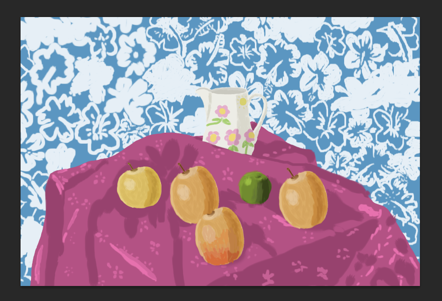
Now here are some of today's ceramics.


While most of the historical ceramics derive from events that happened in the past and the stories that those would be told to be entertained by, these more contemporary ceramics displayed for your viewing purposes, seem to be more derived mostly from nature. Many of today's ceramics can actually come in many different shapes and sizes, and some can still contain pictures of whatever you're interested in. Ceramics are also very profitable as well as there can be people out there that might want to buy specific types of ceramics for decoration.

And now here is my research of a ceramics artist who made a living off of ceramics during her lifetime.

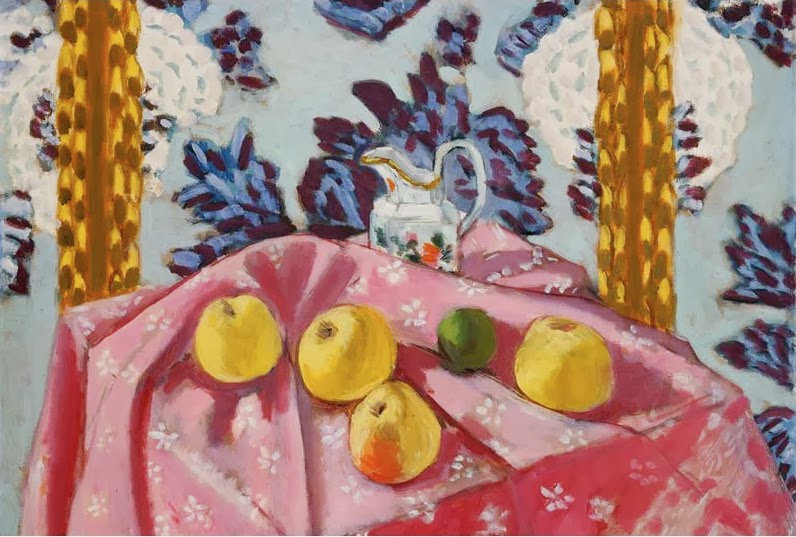
Clarice Cliff (20th January 1899 - 23rd October 1972) was an apprentice potter who became head of the factory artistic department. Cliff worked at A.J. Wilkinson's where she helped the factory designers, John Butler and Fred Ridgway, producing conservative Victorian style wares. She was allowed to decorate defective white pottery and used on glazed enamel colours freehand. She covered imperfections by using simple patterns of triangles and these were marketed as "Bizarre by Clarice Cliff". She was sent to the Royal College of Art in London. On her return she was actually credited for the shapes she designed, she used "moderne" influenced designs, often angular, geometric and many were in the Art Deco style.

These are some of the pictures of Clarice Cliff's work.


Each one of these pots has got an interesting shape. Most of them are rather angular in terms of design and really colourful, because I really do like the simple and retro colours, the use of orange, cerulean, purple, green, yellow, red and pink gives these dishes and pots a sense of vibrance.

Now here's a model of what I have been trying to make for my ceramics course.


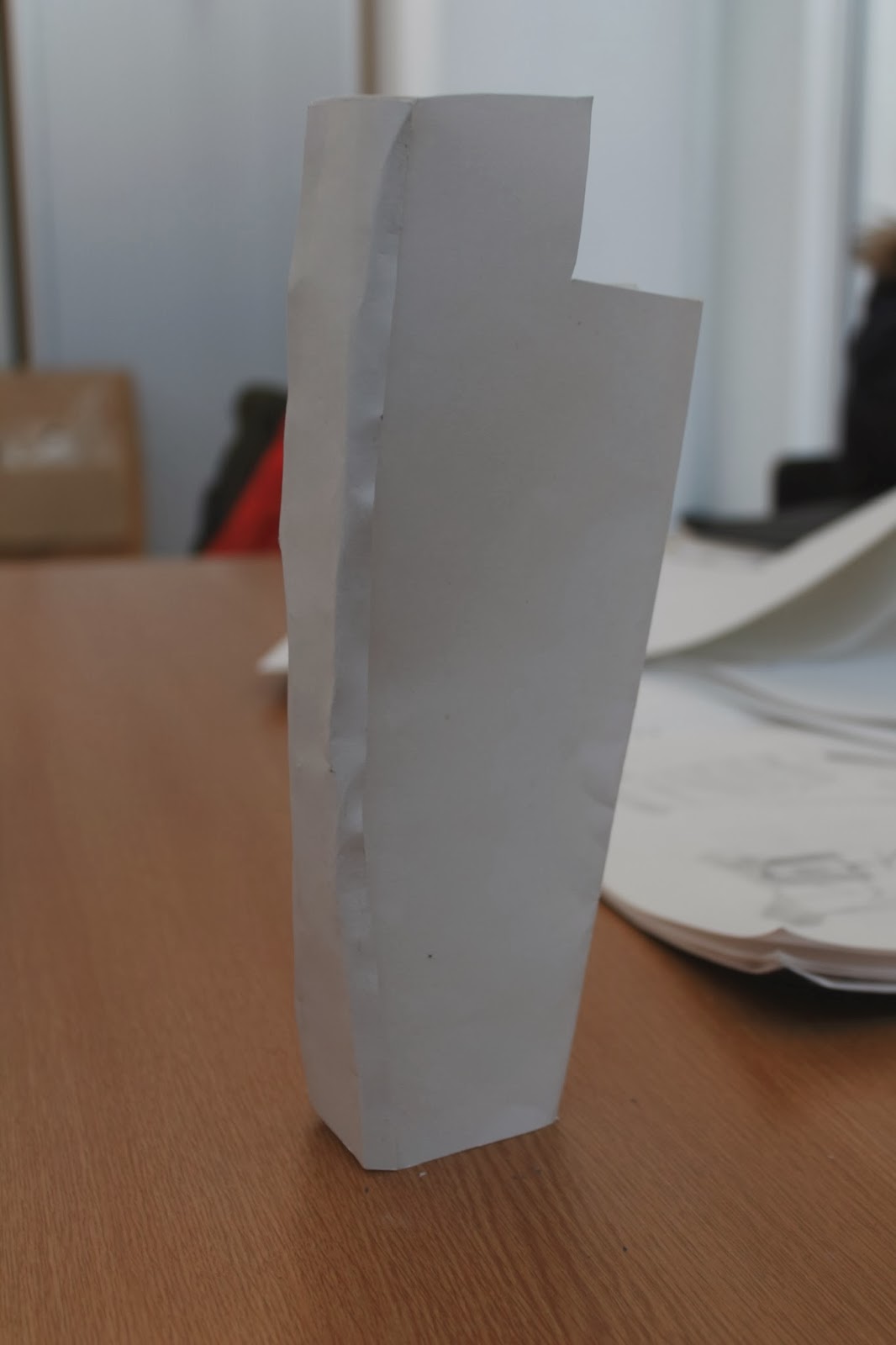
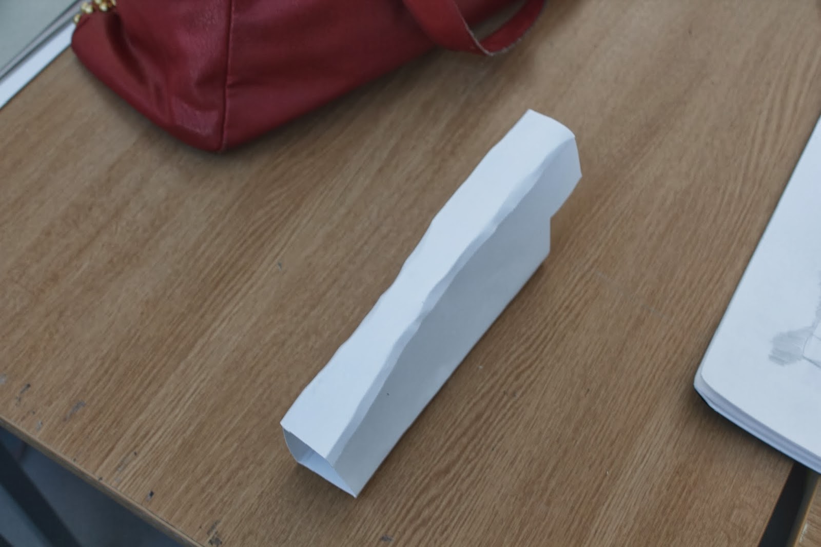
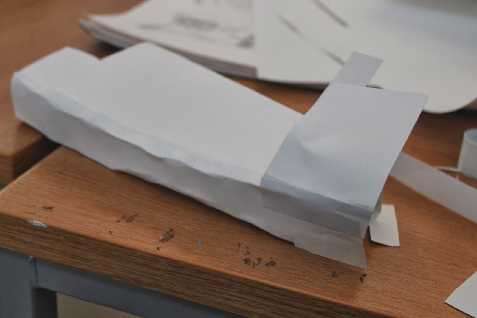
I made these models using simple A3 white paper, I had designed a mini sculpture of my own design, and took six pictures of the sculpture from different angles. However, because my tutor wanted me to make a sculpture from some the drawings that I made in my sketch book, so I made another paper model using my drawings for reference. Obviously I took several pictures from different angles, but I should also note that the sculpture design takes more inspiration from Orlaith Ross' work than Clarice Cliff. I haven't gotten around to making the final sculpture, but at some point this term I will get around to it. By then I will update this post and then I will explain how I made the final sculpture and share my information with you once I've finished.


Sunday, 26 January 2014

Case Study-James McNeill Whistler

James McNeill Whistler (July 11th 1834 - July 17th 1903) was born in Lowell, Massachusetts America but he would later be based in England later on in his life. In his youth, his family travelled a lot due to his father's work as a rail road engineer. Living in St. Petersburg, Russia and London, his mother hoped for him to be a minister, but realising he was in the wrong career he applied to US Military Academy at West Point. However this was not a successful career move as he fought against authority. He became a draftsman mapping the US Coastilne, but becoming bored, he doodled in the map margins. However, during this time he learned the etching technique. He went on to study art in Paris in 1855.

Whistler used the Realism style and painted a wide range of subjects from portraits to landscapes. He particularly took inspiration from landscapes where there was fog or mist. However, his most famous painting was "Arrangement in Grey & Black Number 1", commonly known as "Whistler's Mother".

The main subject matter of his work varied between portraits and landscapes. His landscapes concentrated mainly on seascapes and water, especially with fog and mist.


1.) Black Lion Wharf, Wapping (1859)
This is a lino cut showing the wharf and the men working on the boats and quayside. The jumble of buildings in the background suggest hustle and bustle, but the man in the foreground is resting and makes us wonder if he has finished work or is preparing to start working.


2.)Nocturn (1878)
This painting shows the city in the background and a figure on a boat on either the river or the sea. The city reflected in the water but as it is night time the reflection is faint. There is a feeling of isolation as the figure in the boat is seperated from the city.

The mood in Black Lion Wharf is one of activity, but the figure at the front is inactive, although we feel he is ready to start work. In Nocturn it seems lonely and desolate as the figure in the foreground is working alone in what seems to be a grey, foggy night.

Whilst Whistler was an artist of  the school of realism he brings aspects of semi abstract artwork where scenery and figures are blurred and have no clear definition.

Whistler may have been of the realism school of art, he painted with brutal honesty believing in the term "art for art's sake". He avoided and sentimentality of softness in his work, but rather, painted exactly what he saw.

Case Study-George Shaw

George Shaw (born 1966) grew up on the Tile Hill council estate in Coventry. He studied art at Sheffield Polytechnic where he gained a BA in 1989. He went to the Royal College of Art in London where he gained an MA in 1998.
 He drew inspiration from the urban environment which surrounded him as he grew up.

His main subject matter is the area he grew up in, especially derelict buildings and bleak urban landscapes.

1.) Sly and Unseen Day
The mixed colours and use of grey tones show that the subject was painted on a rainy day. The road pulls us forward towards a detatched house and the puddles reflect the house from below.The only colour comes from a post box in front of the house and an outbuilding of red brick. Whilst the painting shows us a dreary day, there is brightness from the reflective water and puddles on the ground. The house is very precise and our eyes are drawn to it because it is almost at the centre of the picture and because of the cream wall, it is the brightest house in the area.

2.) Valentines Day
In this painting, the colours are muted but the bushes are a strong green.The subject is one of desolation. It seems to be very sad, the decay of the brickwork is brutally portrayed and the high rise building appears abandoned. The path makes you want to follow it around the corner to see if it is better there.The whole atmosphere is of sadness and loneliness.
                                  
3.) The Time Machine
The colours are clean and bright but the tone is more subdued and the sky is grey. The phone booth seems to be in an industrial landscape and there is a distinction between the booth and the stark backdrop. The focus on the phone booth makes it feel as if by walking into it you can escape the surrounding decay and be transported to any place and time you want to.
4.) The Cop Shop
The subject, although seeming to be in shadow is actually bright, looking to be early morning or evening.The building is only small compared with the surrounding high rise flats, making it appear that the police are in a minority in the area.
5.) The Bus Stop
As with The Time Machine the colours in this picture are clean and the tone is bright, the subject has the appearance of being painted on a sunny day, and the shadows of the bus stop and trees bears this out. The clear lines give the painting a realistic look. This is backed up by the signs of vandalism and graffiti. The bus stop is central but seperarte from the trees and building and is empty, this gives it a feeling isolation and loneliness.

The mood and atmosphere for all of George Shaw's pictures in general is one of sadness at the decaying landscapes. There is an atmosphere of isolation even where the subjects are surrounded by other structures and greenery. The realism of the work shows how dismal our world can be.

 Mr. Shaw uses a style of realism. The paintings are almost photographic in structure and the areas painted are showm "warts and all". The use of umbrol enamel paints gives the colours strength and edges of structures definition. 

The movement that best describes George Shaw's work is naturalistic as he mainly creates pictures featuring English suburban and urban subjects. He is a contemporary artist who is still currently working.

Wednesday, 8 January 2014

Sandy Skoglund Artist's Review

Hello again everybody. Today I'am going to critically review Sandy Skoglund. Even though I had done some of research on this person on my Microsoft Word document for photography….
MS Word document page 1. (made 11.12. 2013)
….I have to do it again because I've been told by one of my tutors to put this on my blog so that I have given evidence of my work to the staff at Blackburn College.
So without further adieu, here is my artist's review on Sandy Skoglund.

Sandy Skoglund is an American artist who specializes in surrealistic photography. They often contain vivid and vibrant colours and they tend to bring in a sense of atmosphere. They also tend to feature animals sometimes.

                                                                                     Here are some examples.


And here's a picture with Sandy Skoglund herself.

Wednesday, 18 December 2013

Sequential Photography

Hello everyone! I'am going to have to keep this post brief, so I will have to tell you all as much as I can about what I did to make stories through sequential photography. So here we go again.

In this sequence of photographs, I was taking some steps, stopped for a bit, pretended to punch myself, and pretend to cry my head of.

In this next sequence I was standing on the marble blocks outside of college, and I was hopping around on each block at a time. Then in the last one I had to stop and move onto the last sequence of pictures.
I was in one of the alley ways in town, and me and a classmate where walking towards each other. I was walking one way, and he was walking the other way.

And that's it for now. I will see all of you in January! So once again, Have yourselves a Merry Cherry Christmas and a Happy New Year.

My Recreation of Henri Matisse's Still Life Painting

Over the past several weeks, I have been working on recreating one of Henri Matisse's still life paintings using Photoshop, and today I have finished this picture. It has turned out pretty good, at least in my opinion, and now I'am going to explain to you, my readers, how I made this picture and how I have completed it. So here we go.

Still Life with Apples on a Pink Tablecloth (1924)
First I had to look for a picture on Google Images of one of Matisse's still life paintings. I found a few of them, and I decided to choose this one, and then I had to save into my file.

Later on I would take another search on Google Images, and I picked a random picture of a yellow apple to go with the picture. I also this saved into my file.
Then I took a screenshot of one of the apples in Matisse's original painting.

Next I opened up a new layer, and painted over the apple image using one of the brush tool, just so that I could give it the effect of me actually painting the picture by hand.(or at least my attempt at giving it that effect.)

I copied, scaled, and pasted the apple into a different file were the main picture was going to be. I duplicated the apple, and made 3 more apples, I adjusted the colour slightly by using Hue/Saturation tools under Edit and Adjust, and pasted them where the other apples are positioned in the original painting.
I also modified one of the apples by adding in more colour, using the paint tools again, just so that I could make this apple look like the apple with the orange tints from the original painting. Then I pasted the apple into the picture, along with all the other apples.

                                     
Soon I had to add and recreate the green apple by looking for a random picture of a green apple, by looking through Google Images again.
 After opening up another new layer, I used the brush tool once again to paint over the apple.                        
And as soon as I had copied, scaled and pasted the green apple painting onto the main picture, I would have to make a few adjustments by using the eraser and brush tools, so that the apple would fit in a bit more with the other apples, because otherwise, the apple would look really strange.
For the wallpaper background, I would yet again use Google Images to look for a background for the painting, to be closely be similar to the wallpaper in the painting.
  Because the Image that I had found was red, I had to use Hue/Saturation to change colour of the wallpaper into a light shade of blue.
I then had another layer opened and used brush tools again to paint over the picture in blue. I then lower the pictures opacity so that I could concentrate on painting the flower patterns on the wallpaper.
In between recreating the wallpaper and the apples, I had to open a new layer to paint in front of the original painting, so that I could make the table cloth from the original. I had toned down the opacity and used the brush tools to paint over table to get as much detail as much as I could, and give it the painted look of Matisse's original work. 

I went on Google Images again to look for an image of a water jug to use as a substitute for the jug in the painting. I dragged out the image into the desktop, opened it up on Photoshop, and added another layer, so that I could paint into it.
I painted the jug using the brush tool, added shading like I did with the other paintings, opened up another layer to add in some decorations of my own, rather unmanly design, and combined the layers so that I could copy, scale and paste the final picture into the recreated painting.
Later on I would tone down the opacity of the painting, copy, scale and paste the water jug file into the picture, and used the eraser tools to rub out the bottom of the jug so that it would fit in nicely with the rest of the painting.
Henri Matisse's Still with Apples on a Pink Tablecloth
recreated by Aidan Fitzpatrick (2013)                
And at last, here's the final picture, I hope you enjoy looking at this picture, because even though it took several weeks to make and it was a lot of hard work, I'am nonetheless proud of how the final product came out. So see you all later in my next post, and have yourselves a Merry Cherry Christmas and A Happy New Year.

Thursday, 5 December 2013

Tonal Self Portrait

Hello everyone! Today I will  tell you all about how I created a tonal self portrait, in the style of a lino print by using Photoshop, I will be brief about the details, but I will explain as much as I can, so here it goes.
It all started when I was tasked by my tutor to go on one of the Mac computers, go on my account and get to work. Before I could work with Photoshop, I had to take a picture of myself using Photo Booth. I never used Photo Booth very often, but overall it was fun taking silly pictures of myself before picking one that I wanted to work with. I saved this image into one of my college files so that I could keep it.
I then had to download this photograph onto Photoshop. I had to click on Image, Mode and Greyscale to turn this picture from full colour to being completely monochrome. I also had to save the image into another one of my files to keep it without affecting the original picture.
  Afterwards, I had to open"Layer", double click background to unlock the layer, and then I used the magic wand tool to get rid of the background in the picture. To make things quicker I felt like using the eraser tool, because I had found it much easier to utilise than clicking on some of the pixels in that make up the picture. Afterwards, I had to save this picture as another separate file, while also attempting to keep the original picture unedited. 
 Later on, I opened up some more layers to select the tones in my picture. I had filled in the shadows in black, then I filled in the mid-tones to 50% black and the highlights 20% black.
I then to fill in the other tones in the picture to have it completed, right before I had it saved again into another one of my files. I may have had some help from my tutor to progress with this tonal piece, but I at least managed to get the job done ready for it to print out, so that I could have stuck into my book. It was a lot of hard work, but I am glad to have finished this picture in no time at all.