Wednesday 12 March 2014

Textiles

Over the last few months of college, I had been experimenting with different sewing and felting techniques to make some pretty decent work. So here is some of the work that I have made throughout the months.
I had made this ball by using green and purple felt. First I had to use some bubble wrap and roll it around like a ball, then I proceeded to cover the bubble wrap with the green felt that I had mentioned above. I had to dip the felt into warm water, and then I had to scrub the felt by using towels, so that I could dry the felt. I put the purple felt over the green felt and did the same thing, (though I'm pretty sure that I felted the materials first, and then I proceeded to put bubble wrap inside the ball, which, thinking back, was at first meant to be a heart) then I had to remove the bubble wrap out of the ball and even though it had a few holes, the ball managed to stay intact. Although I had thought that the ball looked ruined at first, my tutors have told me that the holes actually give the piece of felt a lot of charm and creativity, because the holes make it very interesting. In that case, I would have to agree with them, because in the end, it's actually not that bad as it is interesting to look at, and it will probably be something that other people will appreciate and give commentary to this felt ball someday.

Anyway let's talk about some of the other pieces of work that I have done in textiles.
I made this sewn portrait of myself, using one of the sewing machines in the textiles room. I had used blue and green sewing thread to draw the outline of my portrait, while also using a printed copy of a photograph of myself on the other side of the fabric, on top of a black fabric. To be fair, I had focused a bit more on the backside of the fabric with the black material, because I thought I was sewing my self portrait on the back. Anyway, I had also sewn on some blue fabric for my shirt, because one of the Tuesdays when I was doing textiles, I had been wearing one of my hoodies (which was blue by the way). I had also used brown felt for my hair, and sewn it through the other side of the fabric, because my tutors said that the lighter side of the self portrait was much better. I had actually used small fractions of the brown felt, put water on the felt and sewn it through the cloth while using styrofoam. I even had to tear of the photo of myself from the fabric, and only leave the little bits of, even if I was tempted to remove all the little bits of paper it was only going to end getting more fiddly  the more I would have kept messing about with it. 
During the next few weeks in textiles, I had been making a scarf by using two different coloured cloths, cutting them up into stripes, folding them into a pattern and adding in some threads and more cloth into the mix, once I had sewn the stripes together and cut of some the bits that I didn't need. I had borrowed some inspiration to make this scarf from some of fashion and architectural research that I had put into one of my college work books (the one on townscapes) and the scarf itself not only ended up looking like a skyscraper with street lights all over it, but some people thought that it looked a bit like a skirt/kilt which was not what I had initially intended. When wearing it however, it also looks a bit like something that people of Arabic or Pakistani ancestry would wear. The scarf was very time consuming to create, but in conclusion it was hard work that was well worth the effort that I had put into the scarf's creation.
Here are some pictures of myself wearing my scarf, making stiff poses from different perspectives. As far as I'm concerned, I think I may have pulled of the scarf very well if not decently. Unfortunately there's really no need for the background because it is distracting for the viewer to pay attention to the model that they are supposed to be looking at. The last picture of me turning my head over my shoulder is good, but again it would be better without the distracting background.
And here are some pictures featuring one of my classmates. My tutor had suggested that after I had taken all the pictures of myself wearing the scarf, I would need a female model to pose for me whilst I take a few pictures of her from different angles, as long as she was wearing my scarf. She managed to be a really good model, but I think the next time that she does poses for my photographs, she might need to create more lively poses to give my pictures a little bit more movement. However is an improvement from my last batch of photographs that featured myself wearing the scarf, as there are no distracting backgrounds for the to not pay any attention to the model, that is a bit of a huge step on my part, if you ask me.

Now to conclude this post, I would like to say that although creating all of those textile pieces was very time consuming, (especially the scarf!) it was all still a rather interesting endeavor, and I actually had a bit of fun with this project. I would like to thank all the tutors for helping me with this project, because without them, none of this would have been possible and I wouldn't have been able to finish some of this work by myself without their encouragement. So until next time, I will see you all when I publish another blog post.

Tuesday 11 March 2014

Biographical Artists Research part 3 - Banksy

Now last post, I had talked about the artistic comedy duo, Gilbert and George, but in this post however, I'am going to be talking about a very influential, but most certainly a somewhat political and mysterious artist. This person goes by the stage name, Banksy.
Banksy 'himself' as seen in his documentary "Exit Through the Gift Shop"
Bansky's logo
'Banksy' is a graffiti artist, painter, political activist and film maker, who is based in the United Kingdom. He is able to insert dark humour into his artwork, by executing them using a 'distinct' stencil drawing style. Banksy's work was made up of the Bristol underground scene, this mainly involves collaborations between him and other artists.

According to author and graphic designer, Tristan Manco and the book Home Sweet Home, Banksy "was born in 1974 and raised in Bristol, England. The son of a photocopier technician, he trained as a butcher, but became involved in graffiti during the great Bristol aerosol boom of the late 1980's". (This bit of information is not 100% confirmed because his true background and upbringing are still unknown to this day as he has still kept himself a mystery to this very day.) Observers have often noted that his art style is similar to that of an artist called Blek le Rat,(who began working with stencils in 1981 in Paris, France) but Banksy has insisted that he was inspired by another artist called Robert Del Naga, (also known as 3D) who was also a graffiti artist and would later become a founding member of a band called Massive Attack. 

Though known for his contempt towards the government for labelling graffiti as vandalism, Banksy is still able to display his artwork on display all over public city surfaces such as walls, he even went far enough to actually build his own physical prop pieces.

Banksy would later make a documentary that would be released in 2010 called "Exit Through the Gift Shop" which critics would describe as "the world's first street art disaster movie".

So now, let me give you an in depth analysis on some of Banksy's graffiti artwork.


This picture displays a member of the government police department making sure that Dorothy Gale from "The Wizard of Oz" (as played by Judy Garland) doesn't have anything illegal, such any form of drugs, stuffed into her picnic basket. It should probably be a little joke concerning Dorothy's positive personality or the the fact that the Land of Oz may have been a figment of Dorothy's imagination, but in the film, even though Dorothy looks like a full grown woman, she is actually meant to be portrayed as a little girl, so to me, I don't think that joke works because a child around her age shouldn't actually be exposed to any illegal drugs whatsoever. But the artwork itself is actually really good, I really like how Banksy puts a lot of detail in his work, especially because it makes pictures like this one look rather realistic. It's also interesting to note that there is also no colour in this picture except for the policeman's glove (which is coloured light aqua). It is also a bit of an obvious reference to the fact that "The Wizard of Oz" started without any colour whatsoever, until Dorothy and her dog Toto end up in Oz after being sucked away by a tornado.


 In this picture, a child is crying because she is being taken away by two of the most popular children's icons ever to surface the world of popular culture, Disney mascot Mickey Mouse (as portrayed at the Disney World/Disneyland theme parks) and the mascot of McDonald's restaurants, Ronald McDonald the clown. I think the reason why this little girl is screaming is probably because Mickey and Ronald are supposedly portrayed as (sorry for having to say this :( so brace yourselves!) pedophiles, whom are probably two men who have disguised themselves as both one the most beloved and kindhearted characters in all family media and one the most hated and annoying characters who only caters to greedy children, and they appear to be ready to rape this poor child. This would be because she didn't listen to her parents when they told her not to trust or talk to any strangers, especially if those strangers look like the child's favorite characters. It is a social satire on the dangers of pedophillia, and the message is that some people are not who you think they are compared to how you se them on TV. The colour is nowhere to be seen, but the yellow on both "Mickey" and "Ronald's" clothes really stick out the most, though for "Mickey" this is slightly inaccurate because though he does wear a yellow bow tie at Disneyland/World, his trousers are actually a bright red, not yellow, though that one comment was just a nitpick coming from me because I'm a bit of a Disney nerd. Anyway the lack any colour except for yellow gives this graffiti artwork a sense of darkness and sorrow, especially for the little girl because as stated before, she is under great peril, and the authority figures are probably not going to save her from being raped, and it will be an unfortunate life lesson that she may never forget for a very long time.


Now here's an interesting evaluation. This graffiti depicts a little boy with a skateboard, writing on a chalkboard "I must not copy what I see on 'The Simpsons"while ironically, this situation is actually a parody of the "chalkboard gags" from the opening sequence of almost every episode of "The Simpsons", and the boy is portrayed as an obvious parody of one of the main characters, the trouble making son, Bart Simpson. It is also really interesting because back in 2010, Banksy was called over by "The Simpsons" production staff after they had seen his documentary and asked him to storyboard a couch for one of their newer episodes, titled "MoneyBART"(a reference to the 2002 book "Moneyball" which would later be adapted into a feature length film in 2011.) which involved Bart, Lisa and the other kids of Springfield competing in a game of baseball. The couch gag involved was uploaded to YouTube before the actual episode had aired in the USA on the channel FOX on 10th October, 2010. (here's the link for those who want to see the video for themselves https://www.youtube.com/watch?v=DX1iplQQJTo). Once again, the drawing style is realistic, Bart is portrayed as if he were a real boy who had gotten himself in trouble. Unlike the previous pictures, there is a lot of colour on Bart, just like on the show except for the fact that because he is drawn and portrayed realistically, he does not have yellow skin, in case that wasn't obvious (which it is of course, since some of my readers have probably watched "The Simpsons" at some point while the show was on television).


Now for something that has nothing to do with anything from pop culture. This graffiti depicts the personification of death itself (A.K.A. The Grim Reaper). Death is depicted riding on a boat looking for somebody who's soul may have to be reaped very soon. He is also portrayed like he was rowing through the river styx from Greek Mythology which is in and of itself an interesting analogy. Banksy had decided that he would use a white spray can for this graffiti and it came out really to look really spooky, because in my opinion, the white spray can made this picture look very ghost like in nature, as ghosts are the dead spirits of people who have died under unfortunate circumstances, and Death himself is the one looking for those spirits, so that he could take them to either Heaven or Hell. It's also impressive how Banksy was able to create this picture across the city rivers without getting himself wet, unless of course he was wearing waterproof clothes and he had managed spray the picture without trying to get himself wet. Overall this graffiti has a good sense of giving you guys the chills, that is if you feel just a little bit scared while looking at this particular picture.


Now this one is really depressing, a little girl is sitting down on the floor, looking very depressed like nobody actually cares about her, and that her parents were probably so abusive that he managed to run away from them. The balloon that she is holding is probably the one thing that she took with her when she ran away, and has kept it for a little while now. (She had probably just ran away not too long ago from her perspective.) She is so upset, that she probably thinks that nobody loves her anymore and she feels that she may have no future whatsoever. It is as if she has given up on life, and that she has nowhere to go anymore. This graffiti is social commentary on how young children are abused by their parents, run away from them while getting lost at the same time, and feel that their is no hope for them left in the world, disregarding the possibility that there might be nice people out there that could give them a better life and family to make them happy and go on living, so that there may be a much brighter future for them in the end. Again, in terms of artwork the picture is realistic, the lack of colour for the little girl makes the picture very tragic, and the words No Future, are coloured in red so that it symbolizes a sense of anger, abuse, tragedy and sadness for the poor child.

Lastly, this political picture about government using CCTV as a security system for the whole world (though not to exaggerated means though). This is displayed ironically because it shows a policeman (and his dog) is making sure that the child in the red coat washes of a graffiti that says ONE NATION UNDER CCTV and he has a camera so that he can take pictures him washing the propaganda of the wall and show the evidence the authorities. It is ironic because the police is making a child wash of political agenda made using graffiti, as part of a punishment for vandalism, and yet Banksy painted this graffiti on the wall of a building and he got away with it, but that is mainly because he is a professional artist who knows that he making graffiti art even though it will get him into trouble.In April 2009, under the council's order, this piece of artwork was eventually painted over with grey paint, so that the picture would be 'erased', due to the fact that the artwork was still technically vandalism and Banksy would have still been arrested because of the consequence. The overall picture however had a nice balance of colour, the picture was an ironic bit of tongue in the cheek humour and above all else, it may have been a bit sad to not get the chance to see the artwork up close, but it was all for the greater good, because if this picture had not been erased, regardless of his reputation, Banksy would have been in jail for goodness knows how many years, and it would've been a shame to never hear from this mysterious person ever again (that is until it would have been time for him to leave jail and start a new profession all together, at least that's what I think).

So my final verdict on Banksy's artwork, it's actually very interesting how much of an impact this artist has made throughout the years, with both the reputation he gets for vandalism and for being able to be conspicuous about his true identity. I'd say it is pretty darn impressive.

Creating a Pattern with Adobe Illustrator

Greetings everybody, once again I have been doing some experimenting with Adobe Illustrator, but this time I have been creating a pattern for my swatch bar. Here is how I accomplished this achievement.

First I had randomly drawn two jelly beans using both the paint brush tool for one of them and the blob brush tool for the other, then I coloured them in using Pathfinder. I then added a dot in-between them and coloured it the same way that I had done with the jelly beans. Then I had  copied the image a few times, changed them into different shades of green and red and changed the size of each of the pictures.

Here is the first batch of pictures, pre patterned.

I had later added in a fourth copy of the same picture and once again, I would shrink it down to make it smaller and then I would change the shades of colour, then I would rotate the pictures and move them around.

I then added a few more copied images, rotate them, and then I decided to use a different colour to mix it all up so that I don't keep using green too much, (and red and peach for the dots, but that is a minor point.)even though it is one of my favorite colors. So I had decided to use yellow for two of the pictures on display (with the dots  now being a lighter shade of orange).
So once I had settled with the results, I had then decided to draw an outline that looked a bit like a cartoon smiley face. Then I duplicated the image, rotated it and the pre patterned picture wound up looking a little bit like a sushi burger, or at least something remotely resembling a burger in some form or shape.
Now, I had to get going with my pattern, so I clicked Object >Pattern>Make and then I had made a lot of adjustments by moving around the sushi bean balls, moving the strokes to make them end looking like either a tiny twig or simply a bird's beak, added two more sushi balls, put them into the "bird's mouth", move around the sushi balls a bit more, finish the pattern by clicking "Done" on the top left corner and now it had become a brand new pattern. Here is a demonstration of how it looks.
In my opinion, it now looks like a flock of multi-eyed sushi birds trying to eat some oddly coloured sushi balls. I have to say it turned out to be impressive for an illustrated pattern, it's actually not really that bad if I do say so myself.

I hope you all enjoyed reading this post, I will see you later when I have published some of my blogs that I need to finish. Okay bye!!!

Monday 10 March 2014

Cubism Case Study

  1. Cubism was a 20th Century avant-grade art movement first developed in 1908 by Pablo Picasso and George Braque. They worked closely together until the outbreak of World War 1 in 1914. The term 'cubism' was first used by art critic Louis Vauxcelles after seeing a piece of artwork by Braque. He described it as 'little cubes' after which the term was gained worldwide use into the world of art, however Picasso and Braque did not immediately adopt the term.
  2. George Braque, Pablo Picasso and Paul Cezanne were among the key leading artists to have revolutionised cubism in all of it's glory.
  3. It fragmented the subject matter into it's component parts, using geometric shapes and created new and interesting abstract forms. Rather than depict the object from one viewpoint, the artist would depict the subject from multiple angles with random intersecting surfaces and a lack of a coherent sense of depth. The spaces and shapes can be ambiguous leaving it to the observer's imagination.
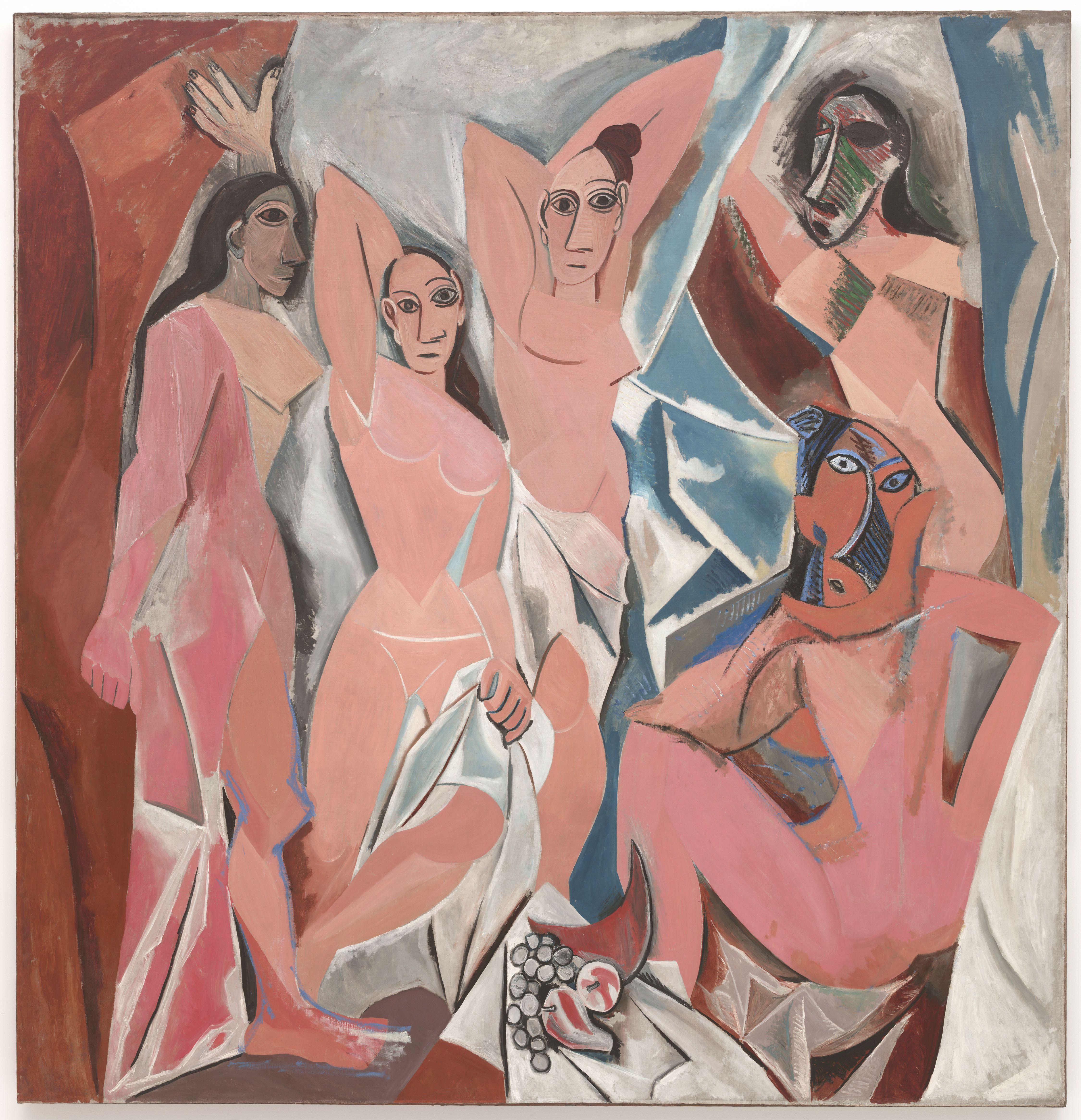
  4. Although it has been widely debated over the years, many people have considered Picasso's own picture, "Les Demoiselles d'Avignon" (1907) was the first ever piece of cubist artwork ever created. Here is a picture for reference.
Les Demoiselles d'Avignon, 1907 by Pablo Picasso
5. The key inspirations for creating the cubism movement are derived from the primitivism found in African, Micronesian and Native American artwork.They were also influenced by the Fauvism movement for their bright colours and semi realistic depiction of life.
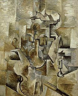
6. The first type of cubism was "Analytic Cubism" which broke down objects into its composing parts or facets that were then analysed and reassembled into an abstract work. This meant that the artist, rather than depicting an item from one viewpoint, depicted it from several viewpoints at once.

Violin and Candlestick, 1910 by George Braque
7. Synthetic Cubism is the second type of cubism artwork. With this technique, many different items were collected together to make new forms. Distinct parts were painted or even pasted onto the canvas and it brought about the use of brighter colours in cubist work. Synthetic Cubism brought about the birth of the collage and this can be seen in what is considered to be the first Synthetic Cubist work Picasso's 'Still Life with Chair Caning'(1911-12). See below-
                                
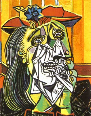
8. Here are two examples of cubist portraits.
Picasso, but not cubism - femme en pleurs
Femme en Pleurs (Weeping Woman), 1937 by Pablo Picasso
This painting was created using oil on canvas. However, it began life as part of a mural painted in protest at the bombing of the town of Guernica by the Germans. The face of the woman was based on his, then, lover Dora Maar.

Girl Before a Mirror, 1932 by Pablo Picasso
Once again, like the previous painting, this picture was made using oil paint on a canvas.

9. Here is my drawing of an African mask, which was one of the key influences in creating the cubist movement to begin with.
I had drawn this picture using a 3B pencil from my pencil case. As you can see I had drawn in a lot of detail with this picture, (especially the shading) and I'am actually proud with how this picture came out. Now here is the photograph that I had used as a reference.
I had to make a quick Google images search to look for this image, and to be honest, this is my second time drawing a picture based on this image. I had previously drawn another image using this image for my case study, but I had unfortunately lost that picture. So now I had drawn another picture using the same image, and second time around, the drawing turned out really well, which was what I had said previously up above.

So now that was my case study on Cubism, I hope you all enjoy it, and I will see you all in the next blog post. See you all until then, bye!

Sunday 9 March 2014

Biographical Artists Research part 2 - Gilbert and George

Continuing of from my lengthy analysis on R.B. Kitaj, I have now done some research on a pair of artists and performers known as Gilbert and George.

2.) Gilbert and George


Gilbert Prousc (or Gilbert Proesch) and George Passmore (both born on 17th September 1943(Gilbert) and 8th January 1942 (George)) are a collaborative duo who work together on creating interesting pieces of artwork, they have been making artwork together since they first met when they were studying the art of sculpture at St Martin's School of Art on 25th September 1967, and they both make a really great team. Although their primary work mainly consists of photographs made to resemble stained glass paintings, they like to refer to their work as sculptures. They got the idea for their "Singing Sculpture" performance from wanting to make themselves into sculptures. They can also be very low brow at times with their work but I'll hopefully not dwell into those kinds of pictures down the line, I'am trying to make this blog more accessible to everyone of all ages, though with these guys that might be a little bit hard. So now that we've gotten that out of the way, let's get down to analyzing these fellows' artwork.
Existers, 1984
In the 1980's Gilbert and George's pictures tend to include a cast of young men. They had installed special lighting equipment into their studio, and they were able to capture the images of youths to great degree of control. In pictures such as this, the guys are arranged into interesting compositions, represented as living embodiments of potency and strength. This work got some controversy, because the artists were accused by critics for exploiting the young men, wrongly calling them rent boys or East End thugs. It is interesting to note that while both Gilbert, George and the youths have light grey skin, their clothes have bright colours, and that not only gives the picture an interesting effect, but it also adds a lot of vibrance to the composition.

Death Hope Life Fear 1984
Gilbert and George have been working together since 1968, and over the years their artwork had been getting more complex and surrealistic since the early 1980's. They had dealt with a wide variety of themes over the years, but one of common themes that they convey tends to be "the social and spiritual situation of urban man". This picture is one in a "group of large complex allegories of fundamental aspects of the human condition", which was another theme that they had conveyed in the  early 1980's. The composition is rather interesting because it displays both of the artists right in the centre of the picture starting out small, but then getting bigger and bigger as they go along, while they are rising upwards to two monstrous mouths that in my opinion, looks like they belong to a green skinned monster that looks like it's going to eat the duo. They are also both surrounded by flames which are apparently supposed to be transferred through their purple suits to apparently give a pulse of life. The other two fellas take up the space in-between the artistic duo because they are have taken up the role in Gilbert and George's artwork as the ideal male image in what maybe a homage to Classical and Renaissance art. (Also it looks like one the guys is having a wee, I just thought I would make an observational comment on that!) It is also interesting to note that were the skin of the artists and the men are grey, (except for the "monster" whom skin is a dark shade of green) the colours for the rest of the picture are very bright and vibrant with a mixture of primary and secondary colours. Wow that was a very lengthy essay! now let's move onto another piece.

England 1980
This is one of their much earlier 1980's artwork, it's a photo collage featuring the artists themselves. This picture contains 30 pictures pasted together to make a single piece of artwork. The pictures of Gilbert and George standing in a pose (making a salute to England) is in greyscale and they are both filled in by six photographs each (which equals twelve might I add!), the other pictures are in colour. Red for the rose in the middle and Gilbert and George crouching down making faces, whom are supposed to be the artists' "gargoyle alter egos" (the rose being filled in by two photographs with the two pieces of Gilbert and George being filled in by four photographs each) and green for the rose leaves in between the rose itself (with the leaves both being filled in by four photos each). The reds are primary so that it both tries to make the monstrous alter egos look scary and gives the rose it's colour, while the greens are dark and they make the rose leaves a lot more darker than they are in real life.

Gilbert & George, ‘Happy’ 1980
Happy 1980
This picture is from a series of artwork called 'Modern Fears' (1980-81). It displays a pictorially heraldic display of different emotions. Whether it would be everyday life, fears, fantasies and the different moods of the artists themselves. The red at the bottom supposedly represents both fear and anger, while the yellow on the top represents happiness, wisdom and tranquillity.

In the end, Gilbert and George are a comedy duo who make really interesting collages that they like to proclaim as sculptures, while they also like to add vague social commentaries into their work that leaves the viewers up for debate and interpretation. All in all their pictures can often be fun to look at sometimes, because they can, more often than not, be really vibrant and colourful as well as interesting.

Next post we will be looking at Banksy, this'll be a fun evaluation.