Wednesday 18 December 2013

Sequential Photography

Hello everyone! I'am going to have to keep this post brief, so I will have to tell you all as much as I can about what I did to make stories through sequential photography. So here we go again.

In this sequence of photographs, I was taking some steps, stopped for a bit, pretended to punch myself, and pretend to cry my head of.

In this next sequence I was standing on the marble blocks outside of college, and I was hopping around on each block at a time. Then in the last one I had to stop and move onto the last sequence of pictures.
I was in one of the alley ways in town, and me and a classmate where walking towards each other. I was walking one way, and he was walking the other way.

And that's it for now. I will see all of you in January! So once again, Have yourselves a Merry Cherry Christmas and a Happy New Year.

My Recreation of Henri Matisse's Still Life Painting

Over the past several weeks, I have been working on recreating one of Henri Matisse's still life paintings using Photoshop, and today I have finished this picture. It has turned out pretty good, at least in my opinion, and now I'am going to explain to you, my readers, how I made this picture and how I have completed it. So here we go.

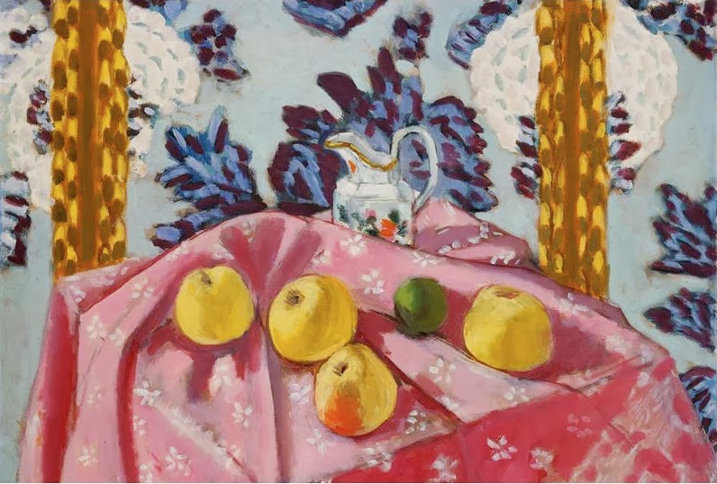
Still Life with Apples on a Pink Tablecloth (1924)
First I had to look for a picture on Google Images of one of Matisse's still life paintings. I found a few of them, and I decided to choose this one, and then I had to save into my file.

Later on I would take another search on Google Images, and I picked a random picture of a yellow apple to go with the picture. I also this saved into my file.
Then I took a screenshot of one of the apples in Matisse's original painting.

Next I opened up a new layer, and painted over the apple image using one of the brush tool, just so that I could give it the effect of me actually painting the picture by hand.(or at least my attempt at giving it that effect.)

I copied, scaled, and pasted the apple into a different file were the main picture was going to be. I duplicated the apple, and made 3 more apples, I adjusted the colour slightly by using Hue/Saturation tools under Edit and Adjust, and pasted them where the other apples are positioned in the original painting.
I also modified one of the apples by adding in more colour, using the paint tools again, just so that I could make this apple look like the apple with the orange tints from the original painting. Then I pasted the apple into the picture, along with all the other apples.

                                     
Soon I had to add and recreate the green apple by looking for a random picture of a green apple, by looking through Google Images again.
 After opening up another new layer, I used the brush tool once again to paint over the apple.                        
And as soon as I had copied, scaled and pasted the green apple painting onto the main picture, I would have to make a few adjustments by using the eraser and brush tools, so that the apple would fit in a bit more with the other apples, because otherwise, the apple would look really strange.
For the wallpaper background, I would yet again use Google Images to look for a background for the painting, to be closely be similar to the wallpaper in the painting.
  Because the Image that I had found was red, I had to use Hue/Saturation to change colour of the wallpaper into a light shade of blue.
I then had another layer opened and used brush tools again to paint over the picture in blue. I then lower the pictures opacity so that I could concentrate on painting the flower patterns on the wallpaper.
In between recreating the wallpaper and the apples, I had to open a new layer to paint in front of the original painting, so that I could make the table cloth from the original. I had toned down the opacity and used the brush tools to paint over table to get as much detail as much as I could, and give it the painted look of Matisse's original work. 

I went on Google Images again to look for an image of a water jug to use as a substitute for the jug in the painting. I dragged out the image into the desktop, opened it up on Photoshop, and added another layer, so that I could paint into it.
I painted the jug using the brush tool, added shading like I did with the other paintings, opened up another layer to add in some decorations of my own, rather unmanly design, and combined the layers so that I could copy, scale and paste the final picture into the recreated painting.
Later on I would tone down the opacity of the painting, copy, scale and paste the water jug file into the picture, and used the eraser tools to rub out the bottom of the jug so that it would fit in nicely with the rest of the painting.
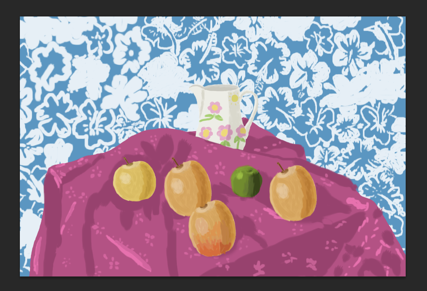
Henri Matisse's Still with Apples on a Pink Tablecloth
recreated by Aidan Fitzpatrick (2013)                
And at last, here's the final picture, I hope you enjoy looking at this picture, because even though it took several weeks to make and it was a lot of hard work, I'am nonetheless proud of how the final product came out. So see you all later in my next post, and have yourselves a Merry Cherry Christmas and A Happy New Year.

Thursday 5 December 2013

Tonal Self Portrait

Hello everyone! Today I will  tell you all about how I created a tonal self portrait, in the style of a lino print by using Photoshop, I will be brief about the details, but I will explain as much as I can, so here it goes.
It all started when I was tasked by my tutor to go on one of the Mac computers, go on my account and get to work. Before I could work with Photoshop, I had to take a picture of myself using Photo Booth. I never used Photo Booth very often, but overall it was fun taking silly pictures of myself before picking one that I wanted to work with. I saved this image into one of my college files so that I could keep it.
I then had to download this photograph onto Photoshop. I had to click on Image, Mode and Greyscale to turn this picture from full colour to being completely monochrome. I also had to save the image into another one of my files to keep it without affecting the original picture.
  Afterwards, I had to open"Layer", double click background to unlock the layer, and then I used the magic wand tool to get rid of the background in the picture. To make things quicker I felt like using the eraser tool, because I had found it much easier to utilise than clicking on some of the pixels in that make up the picture. Afterwards, I had to save this picture as another separate file, while also attempting to keep the original picture unedited. 
 Later on, I opened up some more layers to select the tones in my picture. I had filled in the shadows in black, then I filled in the mid-tones to 50% black and the highlights 20% black.
I then to fill in the other tones in the picture to have it completed, right before I had it saved again into another one of my files. I may have had some help from my tutor to progress with this tonal piece, but I at least managed to get the job done ready for it to print out, so that I could have stuck into my book. It was a lot of hard work, but I am glad to have finished this picture in no time at all.

Tuesday 22 October 2013

Yorkshire Sculpture Park - Level 3 Art and Design

 On Wednesday 25th September 2013, me and my classmates went to the Yorkshire Sculpture Park in Wakefield as part of our course. We had to take photographs of the sculptures that were on display and then do our research on them. So now I'am going to show you all the pictures I had taken of some of the sculptures and tell you all about my personal opinions on four pieces that I like the best.

The works of Hans Josephsohn
I find these sculptures interesting, because although they look ancient, they are actually really modern. The effect that Josephsohn was going for was achieved due to the metal used was left unfinished after casting to create a rough texture to the surface. The main idea behind these sculptures was to represent the people that Josephsohn had met for the span of his lifetime. The size of the sculptures varies from being larger than an average human, to actually looking life sized. The environment that it is set in contrasts with the subject matter. This causes the sculptures to stand out more.

Name Unavailable
Formal Terrace - Joan Miro

Joan Miro
Joan Miro
The Family of Man - Barbara Hepworth

The Family of Man - Barbara Hepworth

The Family of Man - Barbara Hepworth
Little Girl - Lynn Chadwick                           

       Drawing by Aidan Fitzpatrick 2013
This bronze figure appears larger than life and has smooth and rough textures. The main idea behind this sculpture was presumably to show how lonely the little girl was. This isolation is magnified by it being placed in front of a clearing in the trees, which makes her more secluded.

Buddah - Niki de St Phalle
Buddha - Niki de St Phalle
The Buddha statue is made of mosaic materials including glass, mirrors and stone. This leads to a rough texture. The sculpture itself is really huge in size compared with some of the other sculptures. The artist was into the mother figure when she made most of her sculptures, but presumably for this sculpture, she was probably trying to make it a very religious masterpiece to represent Buddhism and make it as serene as possible. This is also reflected by the sculpture's setting.

Riace Figures - Elisabeth Frink
Riace Figure - Elisabeth Frink

Large House - William Turnball
Name Unavailable
The Horse is a Noble Animal - Marcia Farquhar
Well - Grenville Davey
                                                                     
Name Unavailable
Cloaked Figure IX - Lynn Chadwick


Ten Seated Figures - Magdalena Abakanwicz